Autumn Update
First created and published: March 30, 2017 and last updated: September 22, 2017. Archived October 19, 2017.
This Quarterly Update is Part of a Series of Investment Commentaries
The Case For Active Investing | Investing during the Trump Era
(Defense Wins Championships) Active Construction in a World of Active Investing
Quarterly Update | Long Shelf-Life Charts for Investing
The Big Picture
Depicted below; Annotated 50+year history of the U.S. 10-Year Treasury Yield. Interest Rates Have Fallen Steadily over Two Generations (and that's now reversing)
Any Investor under 60 Years Old has known nothing other than the Greatest Bond Bull Market of All Time
The 40-Year Secular Decline In Interest Rates is Ending. From 1962 to 1979, America's insistence on both Guns and Butter (Vietnam and Lyndon Johnson's Great Society) exposed our economic flanks to the Arab Oil Embargo, and two oil shocks culminated in a nasty period of Stagflation. Fed Chairman Paul Volcker earned his spot in history with his decisive victory against inflation. In 1981, the yield on the U.S. 10-Year Bond set its generational high at 16%, and has since declined to 3%. (This chart was last updated on September 22, 2017)
The Greatest Bull Market in Bonds also fueled a massive Bull Market in All Asset Classes
U.S. Household Net Worth & U.S. 10-Year Treasury Yield
Stagflation (1979) USD $8 Trillion with 10-Year around 16%
Cold War (1987) USD $18 Trillion with 10-Year around 10%
Y2K & Internet Bubble (2000) USD $42 Trillion with 10-Year around 6%
Housing Bubble (2007) USD $67 Trillion with 10-Year around 4%
QE Bubble (2017) USD $95 Trillion with 10-Year around 2.2%
Federal Reserve Statistical Release | Z.1 FInancial Accounts of the United States
In 1981, the U.S. 10-Year Treasury hit its generational high yield of 16% as Fed Chairman Paul Volcker tightened U.S. monetary policy to whip inflation. Falling interest rates boost asset prices (in all asset classes: stocks, bonds, real estate, etc.) through the discounting mechanism. By mathematical extension, zero interest rates would act as NOS (nitrous oxide system, a la Fast & the Furious). (This chart was last updated on August 18, 2017)
The Situation on Wall Street
The Federal Reserve wants to "Normalize" monetary policy. This means that after 7 years of Zero Interest Rate Policy, aka ZIRP, the Fed intends to gradually increase the Federal Funds Rate.
When the Irrational Exuberance of the Internet Bubble wore off, the Federal Reserve, under Chairman Alan Greenspan cut Fed Funds to 1% to relieve the U.S. Economy of the asset bubble hangover.
While conventional practice, 5 years of this medicine, dripped in steadily increasing doses, allowed another malady to gestate: the U.S. Housing Bubble. So when the Greenspan Fed finally took away the elixir of low interest rates, a swollen Housing Bubble finally bust.
This time, the throbbing of aftermath of the Financial Crisis pounded so hard, that the new Maestro tested unconventional medicine devised only in theory as an application to treat Japan's terminal deflation.
Under Chairman Ben Bernanke, the Fed administered a long and heavy dose of Zero Interest Rate Policy.
The U.S. Federal Funds Rate (also called "Fed Funds") is the interest rate at which Banks lend each other money on an overnight basis. The Fed Funds Rates is set by the Federal Open Markets Committee of the Federal Reserve (the "FOMC") and Fed Funds is a key determinant of the ultimate cost of borrowing for both Companies and Consumers. (This chart was last updated on September 22, 2017)
"Normalization" also means the Fed must Reverse and Unwind QE by Shrinking the Balance Sheet from its All-Time High Level
Before 2008, the Federal Reserve balance sheet was a Pristine $755 billion, with the securities portfolio invested entirely in U.S. Treasuries. By 2015, the Fed balance sheet increased by 360% to $4.2 Trillion after 3 Rounds of Quantitative Easing. Of the $3.4 Trillion increase, the Fed purchased $1.7 Trillion in Treasuries to keep short term rates low, and another $1.7 Trillion in mortgage-backed securities to stimulate the effect of an interest rate cut below zero. By 2017, the Fed began to communicate its intent to "Normalize" its balance sheet. (This chart was last updated on September 22, 2017)
The $20 Trillion Question with the S&P 500 at an All-Time Highs
Wait . . . no more QE?
The S&P 500 is the most widely followed index for U.S. stocks. (This chart was last updated on September 22, 2017)
Cognitive Dissonance, Illustrated. Despite the Unknown of Reversing QE, the cost of stock market insurance has never been cheaper.
VIX is the measure of stock market insurance. Unless specified, VIX is usually associated with the S&P 500 Index. (This chart was last updated on September 22, 2017)
The Situation, Summarized
The Situation on Main Street
Scylla & Charybdis
As much good as the Federal Reserve has done, the Fed has also caused misery for many Americans. (Charybdis, the Vortex) Zero Interest Rate Policy, for 7 long years #ZIRP-ed the value of savings while creating dramatic increases in financial assets, such as real estate. (Scylla, the Six-Headed Monster) Asset price inflation in rental property is one factor driving rent to outpace wage gains, causing a Big Squeeze for consumers. It's treacherous out there.
Housing Prices are Approaching All-Time Highs
The Case-Shiller Index hit 206 in June 2006, then plunged during the Housing Crisis and stayed below 140 (a 30% decline) through 2013. (This chart was last updated on September 5, 2017. The data reflects June 30, 2017.) The Case-Shiller home price data is typically cited either as part of a 10- or 20-City Composite. Case-Shiller is the most well known data series cited for trends in U.S. Home Prices. This methodology is designed to track actual observed price changes, and today Standard & Poor's publishes a modified version of this index for 20 metropolitan areas.
Meanwhile, the Home Ownership Rate continues to decline
The Community Reinvestment Act, initially enacted by Congress in 1977 to banish redlining, was revised in 1996.
Finding Affordable Housing is Getting Tougher Each Year, because Rental Vacancy Rates are at Decade Lows
(This chart was last updated on August 18, 2017. The data reflects June 30, 2017.)
Paying Monthly - Apartment Rents
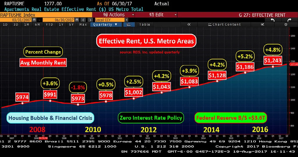
From 2011 to 2016, monthly rent has increased by 4.1%
Since the Financial Crisis, rental property values has increased significantly. This benefits owners of Rental Property, but squeezes Disposable Income for those who rent their housing. (this data set was last updated June 30, 2017)
Earning Hourly - Not Enough Wage Growth
From 2011 to 2016, wages have growth by 2.5%
Source: Federal Reserve Bank of Atlanta (This chart was last updated on September 22, 2017)
The Big Consumer Squeeze
The Squeeze, Illustrated. From 2011 to 2016, apartment rents increased by an average of 4.1% and outpaced wage growth of 2.5%.
In this example, Rent has increased from 45.0% to 49.3% of income.
Here is the math to back up the illustration.
U-3 Overstates Economic Vitality
First Glance, the Labor Market is Tight with only 4.4% Unemployment Rate
U-3 is the number of unemployed people as a percentage of the labor force (those working or actively looking for a job). (This chart was last updated on September 22, 2017 with data from June 30.)
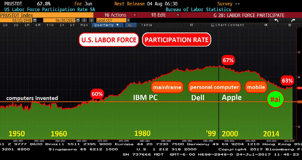
Second Look, the Labor Force Participation Rate is only 63%
The U.S. Labor Force Participation Rate climbed from 60% to 67% during the Personal Computer Revolution. The implication is that as many as 10 million Americans are choosing not to participate in the labor force.
The U.S. working age population (defined 16 to 64 years of age) is approximately 200 million.
Third Point. To reiterate, wage growth is lackluster
Source: Federal Reserve Bank of Atlanta (This chart was last updated on September 22, 2017)
"Tight" Job Market and The Consumer
The Conference Board, Consumer Confidence Index
This survey asks respondents to assess current business conditions and appraise their own income prospects. With U-3 unemployment at 4.4%, job openings are available, so this survey should register strong results.
(This chart was last updated August 31, 2017)
University of Michigan Consumer Sentiment Index
The University of Michigan survey asks respondents to assess current business conditions and appraise their own income prospects. University of Michigan also asks about future buying intentions.
Each month, 500 individuals are randomly selected from the contiguous United States (48 states plus the District of Columbia) to participate in the Surveys of Consumers. In order for the results to accurately represent the opinions of the population of the United States, it is important that each person selected participates. The questions asked cover three broad areas of consumer confidence: personal finances, business conditions, and future buying plans. (This chart was last updated September 21, 2017)
Defying Inflationary Pressures
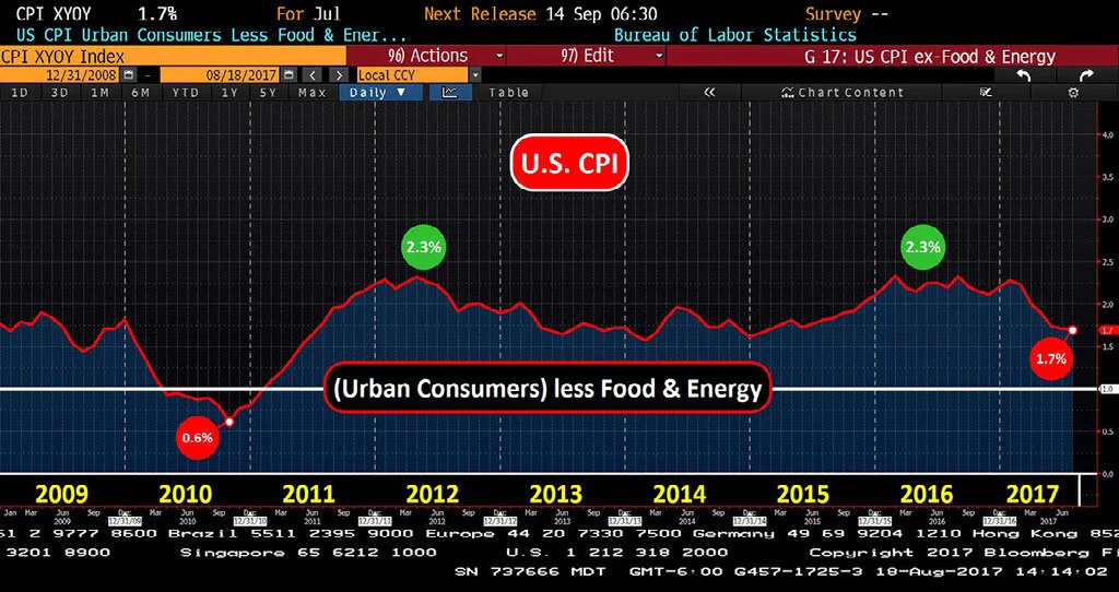
Reported monthly by the Bureau of Labor Statistics, CPI attempts to measure the change in prices paid by consumers for a market basket of consumer goods and services.
CPI remains stuck
Denying Inflationary Pressures
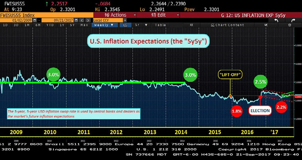
The Market has priced in lower inflation ahead.
The 5-Year, 5-Year (5Y5Y) is the market's guess for the 5-year outlook for inflation, 5 years in the future. This rate also influences the price for U.S. Treasury Bonds. (This chart was last updated on September 21, 2017)
The U.S. 10-Year is on Life Alert ("help, I've fallen and I can't get up")
Interest Rates
The U.S. Federal Funds Rate (also called "Fed Funds") is the interest rate at which Banks lend each other money on an overnight basis. The Fed Funds Rates is set by the Federal Open Markets Committee of the Federal Reserve (the "FOMC") and Fed Funds is a key determinant of the ultimate cost of borrowing for both Companies and Consumers.
To calm the Financial Crisis, The Fed and the United States Treasury led rescue efforts. The Treasury provided immediate relief with Bailout capital, to both Wall Street and Detroit. The Federal Reserve responded by implementing Ben Bernanke's Helicopter Money philosophy of the Zero Interest Rate Policy. Under Bernanke, the Fed lowered the Fed Funds rate to 0%. The Fed also purchased nearly $2 trillion of U.S. Government Bonds as well as nearly $2 trillion of Fannie Mae and Freddie Mac mortgage bonds from Wall Street.
Z.I.R.P. The Fed ZIRP-ed the American public to subsidize bank recapitalization. One year and 8 months after "Lift-Off", Fed Funds is 1.16%.
Reflexively, changes in the cost of borrowing simultaneously impact the level of interest income earned by Savers in instruments such as savings accounts and certificates of deposit. American Savers continue to shoulder the cost of recovery from the Financial Crisis as interest rates have languished near 0%.
(chart updated September 22, 2017) 20-Year History of U.S. Federal Funds Rate: Fed Funds at 5.5% implies an American with $100,000 in savings earned, each year, at least $5,000 in (safe, consistent) interest income. Fed Funds Rate is starting to rise, but #Lift-Off has been under-powered relative to the lost savings income over the past decade.
Alan Greenspan served as Chairman of the Federal Reserve from 1987 to 2006. Greenspan was appointed by President Ronald Reagan and later reappointed by Presidents George H.W. Bush, Bill Clinton, and George W. Bush.
Chairman Ben Bernanke, served two terms as Chairman of the Federal Reserve (from February 1, 2006 to February 3, 2014). He was appointed by President George W. Bush and reappointed by President Obama.
Chair Janet Yellen, has served as Chair of the Federal Reserve since February 3, 2014 since her appointment by President Obama.
<3-Month LIBOR>
The London Interbank Offered Rate (LIBOR) is the reference interest rate for trillions of dollars of financial derivative contracts. LIBOR continues to Eek higher each week.
Under Alan Greenspan, 3-month LIBOR declined from 5.5% to a low of 1% in 2003. Coincidentally, and perhaps causally, the U.S. home market started to boom. Interest rates (3-month LIBOR) normalized to 5% by 2006. Then, in 2007, the Housing Bubble began to burst, creating a Financial Crisis and the Great Recession. Fed Chair Ben Bernanke then introduced the Zero Interest Rate Policy, or ZIRP. (chart last updated September 22, 2017)
<U.S. 10-Year Treasury Yield>
Depicted above is the U.S. 10-Year Treasury Yield, going back to 2009, the Housing Bubble and the Financial Crisis. (This chart was last updated September 22, 2017)
The Sudden Rise in U.S. 10-Year Yields after Election 2016
(Depicted above is the 1-year chart for the U.S. 10-Year Treasury Yield, last updated September 22, 2017) The sudden rise in 10-year yields after Election 2016. The Election did what the Fed could not - The 10-Year Treasury yield increased by nearly 1% to 2.6%. However, yields have been declining again since the President's 100 Day mark.
U.S. Dollar & FX
The U.S. Dollar Index is the trade-weighted basket of major foreign currencies. The Canadian Dollar is 12% of the Dollar Index. The Japanese Yen makes up another 12%. The remaining ~75% is comprised of the Euro and other European currencies.
(last updated September 22, 2017) Since 2012, the Dollar Index has surged to 100, but failed to break above this level
<U.S. Dollar Index & 10-Year Treasury Yield>
Since 2015, the Dollar Index (in Red) has poked above "100" several times, but each time, the Dollar has failed to break out above this level.
(last updated September 22, 2017) In Red, the U.S. Dollar Index which peaked at 151 in 1984 and hit another high at 119 in 2001. In white, the U.S. 10-Year Treasury Yield over the same time period.
<Euro FX Cross Rate>
<Japanese Yen FX Cross Rate>
<U.S. Auto Sales>
Auto sales plunged during the Financial Crisis, and it took nearly 10 years to return to annual sales volume of 17+ million cars per year. (chart last updated August 31, 2017)
China
<Foreign Exchange Reserves>
Since being admitted into the World Trade Organization in 2001, China accumulated nearly USD 4 Trillion in foreign exchange reserves in less than 15 years
China added USD 3 Trillion to FX Reserves in less than 8 years, from 2007 to 2014
After years of tariff negotiations, China joined the World Trade Organization on December 11, 2001. China pursued an Export led economic growth strategy which led to the accumulation of USD 4 trillion of foreign exchange reserves. In my opinion, this was a 21st form of Mercantilism, which has run its course. (chart last updated August 18, 2017)
China started to hemorrhage cash after 2014. FX reserves have plummeted by USD 1 trillion in two years, 2014 and 2015. (chart last updated August 18, 2017)
(chart last updated August 18, 2017)
<China Oil Demand>
This is the most important demand chart for oil, the world's most important commodity. Does that red line appear to be flattening out?
In 2002, China used approximately 4.9 million barrels per day of crude oil. By 2012, China daily oil demand grew by 5.7 million barrels to 10.6 million - a rate of annual increase of 570,000 per year. From 2014 to 2016 Apparent Demand topped at 10.6 million barrels per day, but has recently broken above this previous high. This data set, available since February 2012, is calculated by Bloomberg under symbol "CHODTTL." (chart last updated August 18, 2017)
Oil
The World's Most Important Commodity


